Эффект перекоса с помощью Css
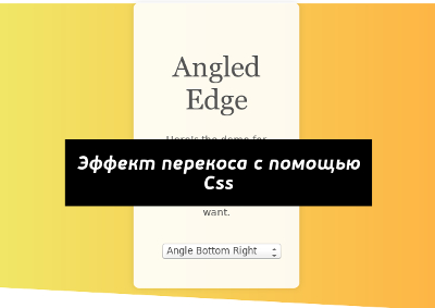
In this post, we’re going to look at how we can create a angled edge effect (horizontally) on a web page. Basically, it looks something like this:
Having a slightly angled edge should make our web layout look less rigid and dull. To do this trick, we will be using the pseudo-elements ::before and ::after and CSS3 Transform.
Using Pseudo Elements
This technique uses the pseudo-elements ::before and ::after to angle the element edges. In this example, we will be adjusting the bottom edge.
.block{ height: 400px; width: 100%; position: relative; background: linear-gradient(to right, rgba(241,231,103,1) 0%, rgba(254,182,69,1) 100%);}.block::after{ content: ''; width: 100%; height: 100%; position: absolute; background: inherit; z-index: -1; bottom: 0; transform-origin: left bottom; transform: skewY(3deg);} |
Let’s recap.
The transform-origin specifies the coordinates of the element we want to transform. In the example above we specified left bottom that will put the starting coordinates on the bottom-left side of the block.
The transform: skewY(3deg); makes the ::after block skew or angle at 3 degrees. Since we specified the starting coordinate as bottom-left, the bottom-right of the block raises 3 degrees. If we swap the transform-origin to right bottom and the bottom-left corner will be raised 3 degrees instead.
You can add a solid color background or gradient to see the result.
Make It Easier with Sass Mixin
To make this easier, I have created a Sass mixin to add the angled edges, minus the headaches from dealing with the complexities of style rules. With the following mixin you can quickly specify the side – top-left, top-right, bottom-left or bottom-right – to skew.
1 2 3 4 5 6 7 8 9 10 11 12 13 14 15 16 17 18 19 20 21 22 23 24 25 26 27 28 29 30 31 32 33 34 35 36 37 38 39 40 41 42 43 44 45 46 47 | @mixin angle-edge($pos-top:null, $angle-top:null, $pos-btm:null, $angle-btm:null){ width: 100%; position: relative; background: linear-gradient(to right, rgba(241,231,103,1) 0%, rgba(254,182,69,1) 100%); &::before, &::after{ content: ''; width: 100%; height: 100%; position: absolute; background: inherit; z-index: -1; transition: ease all .5s; } @if $pos-top{ &::before{ @if $pos-top == 'topleft'{ top: 0; transform-origin: right top; transform: skewY($angle-top); } @if $pos-top == 'topright' { top: 0; transform-origin: left top; transform: skewY(-$angle-top); } } } @if $pos-btm{ &::after{ @if $pos-btm == 'bottomleft' { bottom: 0; transform-origin: right bottom; transform: skewY(-$angle-btm); } @if $pos-btm == 'bottomright' { bottom: 0; transform-origin: left bottom; transform: skewY($angle-btm); } } }} |
There are four variables in the mixin. The first two variables, $pos-top and $angle-top, specify the top starting coordinate and the degree. The latter two variables specify the coordinate and the degree for the bottom side.
If you fill up all four variables you can angle both sides – top and bottom – of the element.
Use the Sass @include syntax to insert the mixin to an element. You can see examples below:
To add skewed edge on top-left side:
1 2 3 | .block{ @include angle-edge(topleft, 3deg);} |
To add skewed edge on bottom-right side:
1 2 3 | .block{ @include angle-edge(bottomright, 3deg);} |
To add skewed edge on top-left and bottom-right side:
1 2 3 | .block{ @include angle-edge(topleft, 3deg, bottomright, 3deg);} |
Below is the demo with the mixins applied. Change the select box to toggle to another style.
That’s it!

